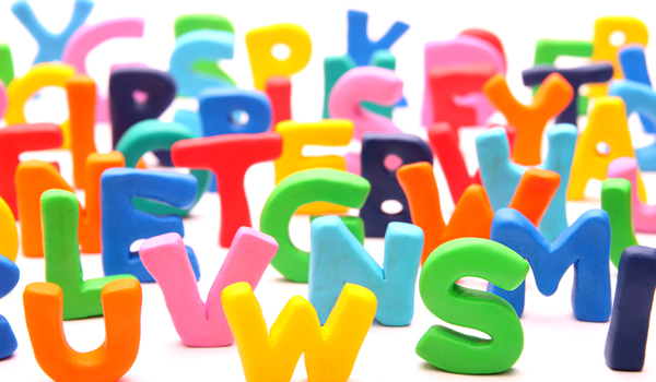
The Dyslexie font, designed in 2009 by graphic designer Christian Boer, claims to have positive effects on reading for those with dyslexia. This development comes from the argument that children with dyslexia require a larger font size and greater spacing between letters to enhance reading abilities. However, dyslexia has historically been known as a phonological deficit, rather than a visual one, calling to question this claim.
There are numerous different interrelated aspects that contribute to the legibility of text: body size (the height of the letter), x-height (the height of the lowercase letter x), spacing, and shape (determined by weight, contrast, serif vs. sans serif, and italic vs. regular). For the Dyslexie font, its focus is on altering the bottom weight of the letter and spacing. For this study, the three main questions the researchers wanted to investigate were: 1) Does the Dyslexie font lead to faster and/or more accurate reading? 2) Do children have a preference for the Dyslexie font? 3) Is font preference related to reading performance? In order to test these, two different experiments were employed.
In the first experiment, a total of 170 Dutch dyslexic students were given two separate reading tests, two weeks apart. The two fonts tested were Dyslexie and Arial. In the second experiment, 147 students, both dyslexic and non-dyslexic, were tested using a different method that included Dyslexie, Arial, and Times New Roman fonts. Three separate sessions took place for each font, one to two weeks apart. At the end of both experiments, the students were asked font preference, and correlation analyses were run.
The results from experiment 1 showed that children with dyslexia showed neither better performance with nor a preference for the Dyslexie font compared to Arial. In fact, more children reported favoring the Arial font over Dyslexie. Experiment 2 also showed no difference in reading ability between the different fonts, across both dyslexics and non-dyslexics. Similar to experiment 1, no group reported a preference for the Dyslexie font.
In sum, this research is intended to contribute to the scientific evidence relative to the issue of a specialized font for dyslexics. Not only did the Dyslexie font not have its desired (and alleged) effects, but it also was not the preferred font of the children tested. Rather, the data suggest that the font a child prefers is probably the most effective for him or her. Parents and teachers should think twice before investing time and money into changing reading behavior via a font. Because dyslexia is a language-based reading disorder (and not a visual one), families can risk wasting precious time and finances on such claims as fonts (and colored glasses and vision therapy), which become a negative distraction from pursuing evidence-based interventions that have been proven to be effective for dyslexic readers. The research is clear that reading behavior is changed through structured literacy intervention.
You can read the full article on the Springer Nature Link site.
Kuster, S. M., Weerdenburg, M. V., Gompel, M., & Bosman, A. M. (2017). Dyslexie font does not benefit reading in children with or without dyslexia. Annals of Dyslexia,68(1), 25-42. doi:10.1007/s11881-017-0154-6

Join our email list
Subscribe to receive
The Latest from DyslexiaHelp
every other month.


